How to choose fonts for your website
Typography might not seem like the most exciting part of building a website. Most beginners are far more interested in colors, images, or layouts. But the truth is this:
Typography affects every single part of your website because almost everything on your site is text.
Your headlines, your descriptions, your buttons, your menus, your product information—all of it depends on how easy it is to read and how good it looks.
At Mozello, we've seen that typography is one of the fastest ways to make your site look instantly more professional. Even if your business is small or you're just starting to create a website, the right font choices can make your entire brand feel more trustworthy and polished.
The best part? Typography doesn't need to be complicated. You don't need design knowledge, and you don't need to know anything technical. What you need is a basic, practical understanding of:
- how to choose fonts
- how to pair them
- how to format your text
- what to avoid
- how to keep your website consistent and readable
This article will walk you through everything step by step, with simple rules and real examples.
Why typography matters
Fonts are not just decoration. They influence:
- readability
- mood and emotional tone
- your brand personality
- trust
- how quickly people can scan your site
- whether visitors stay or leave
Typography is a core part of UX (user experience). If your text is difficult to read or looks unprofessional, visitors lose confidence quickly—even if they can't explain why. On the other hand, when your site uses clean, consistent typography, everything feels easier and more trustworthy.
Good typography is invisible.
Visitors don't notice it—they just enjoy reading.
Bad typography is always noticeable.
Visitors feel frustrated, confused, or tired.
The three main types of web fonts (and what they communicate)
Understanding basic font classifications makes choosing easier. Most fonts fall into three broad families:

1. Sans-serif fonts
Sans-serif fonts are fonts without small decorative "strokes" on the letters.
Examples:
- Arial
- Helvetica
- Lato
- Montserrat
- Open Sans
- Poppins
These fonts feel:
- modern
- clean
- friendly
- simple
They're extremely readable on screens and are perfect for:
- body text
- buttons
- navigation
- modern brands
- tech companies
- small business websites
If you're a beginner, a sans-serif font is almost always a safe option.
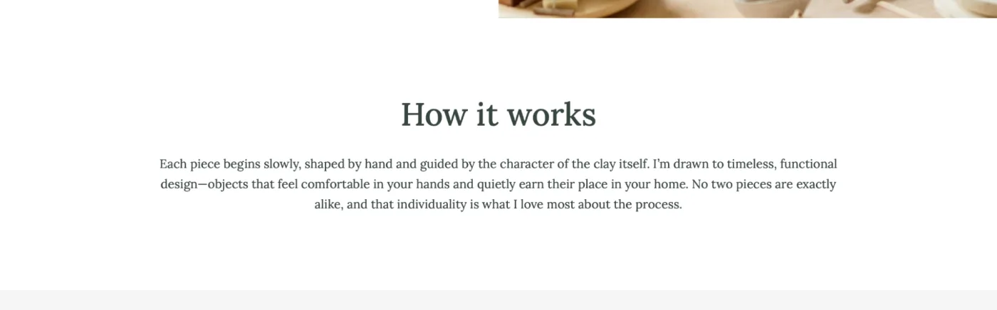
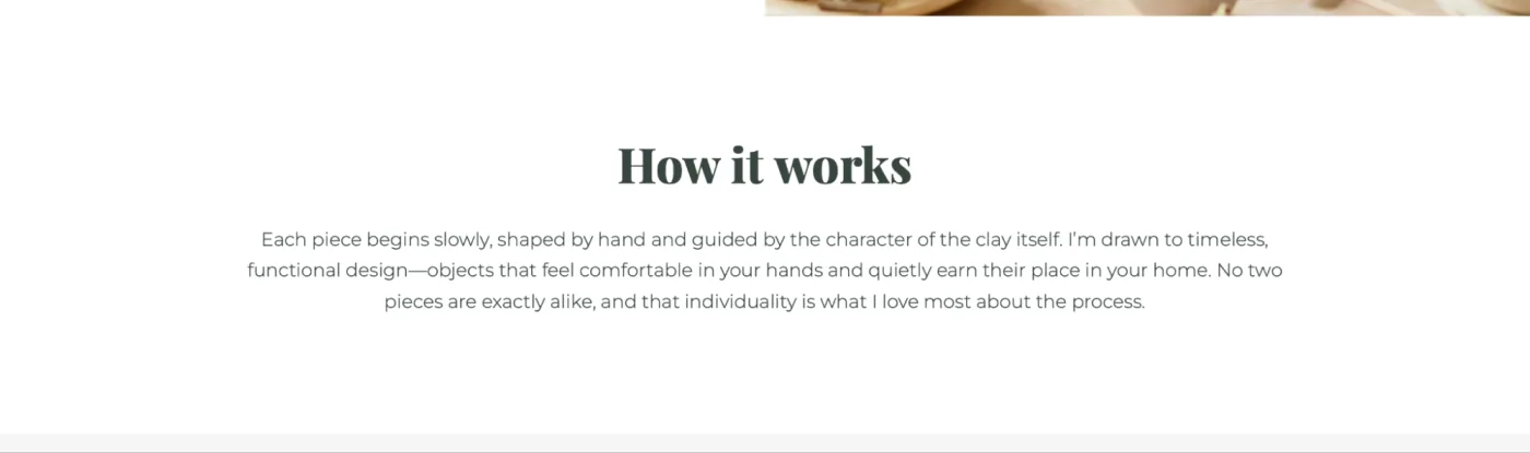
2. Serif fonts
Serif fonts have small lines or strokes at the ends of letters.
Examples:
- Lora
- Playfair Display
- Merriweather
- Georgia
These fonts feel:
- traditional
- elegant
- high-end
- classic
- academic
Serifs are great for:
- headings
- luxury brands
- editorial-style sites
- law firms
- wedding businesses
- magazines and blogs
On screens, serif fonts look best when used for headlines, not long paragraphs.
3. Display or decorative fonts
These are more artistic or stylized fonts.
Examples:
- script fonts
- handwriting fonts
- bold retro typefaces
- quirky or themed fonts
Use these very sparingly:
- logos
- small accents
- special event banners
Never use them for body text or long paragraphs.
How to choose the right font for your business
Instead of choosing fonts based on what "looks pretty," choose them based on your brand personality.
Ask yourself:
- Am I formal or casual?
- Modern or classic?
- Friendly or serious?
- Minimal or expressive?
Examples:
A bakery: soft serif headings, sans-serif body text → feels warm and inviting
A tech startup: bold sans-serif headings, clean sans-serif body text → modern and confident
A luxury jewelry brand: elegant serif headings, thin sans-serif body text → premium and refined
A fitness studio: strong sans-serif headings, clean sans-serif body → energetic and bold
Your font is part of your voice. It should match the message you want your website to communicate.
Why using too many fonts is a mistake
One of the most common beginner mistakes is using many different fonts on one website. This creates visual chaos and makes your site look unprofessional.

Here's the rule:
Use 1–2 fonts total.
A good simple combination:
- one font for headings
- one font for body text
That's it.
This gives your design consistency and creates a smooth reading experience.
Font pairing: how to combine fonts like a designer
If you choose two fonts, they must complement each other—not fight for attention.
Here are the easiest, beginner-safe combinations:
1. Serif heading + Sans-serif body

This is the most classic and professional combination.
Examples:
- Playfair Display + Montserrat
- Merriweather + Open Sans
This combination works for:
- coaches
- bloggers
- boutiques
- photographers
- consultants
- wellness brands
2. Sans-serif heading + Sans-serif body

Clean, modern, and extremely easy to use.
Examples:
- Raleway
- Poppins
- Lato
- Montserrat
This works for:
- tech companies
- small businesses
- restaurants
- ecommerce
- Portfolios
3. Serif heading + Serif body
This can work, but only if both are designed to pair well. It's easy to get wrong.
Better for:
- editorial-style websites
- magazines
- long-form blogs
For beginners, stick to one serif and one sans-serif.
4. Decorative font + Sans-serif body
Only use a decorative font for:
- large or short headings
- a single word in a heading
- a logo
- a small highlight
Never use decorative fonts for long sentences. They're too heavy and hard to read.
Text size and spacing: making your typography readable
Typography isn't just about choosing a font. It's also about how the text sits on the page. Even the best font becomes hard to read if the spacing is wrong.
Here are the foundational rules:
- Use large, clear headings. Your headings should stand out. They guide your visitors and help them scan quickly.
- Make body text comfortable. Too small text is a guaranteed readability killer.
- Use generous line spacing. Tight text feels dense and overwhelming. Make text feel airy and easy to digest.
- Keep paragraphs short. Large blocks of text are tiring. Especially when you create a website and want visitors to understand your message fast, shorter paragraphs work better.
Good example:
A paragraph of 2–4 sentences.
Bad example:
A giant block of 8–10 sentences.
Common typography mistakes beginners should avoid
Mistake #1: Using too many fonts
This is the number one typography mistake.
Your site instantly becomes disorganized. Stick to 1–2 fonts.
Mistake #2: Using fonts that don't match the brand
For example:
- a lawyer using a comic-style font
- a luxury brand using playful handwriting
- a tech company using a vintage Western font
Your font must match your identity.
Mistake #3: Using decorative fonts for paragraphs
Decorative fonts are difficult to read. They should never be used for regular content.
Mistake #4: Poor spacing
Text looks messy when:
- line spacing is too tight
- paragraphs are too long
- headings don't stand out
Spacing is one of the easiest ways to make your site look better instantly.
Mistake #5: Using fonts inconsistent with the rest of the pages
If your homepage uses one font and your About page uses another, visitors immediately notice—even if they don't consciously understand why it feels "off."
Consistency builds trust.
Typography tools that can help beginners
Here are simple tools to find or test fonts:
- Google Fonts – a huge library of web-friendly fonts
- FontPair.co – recommended font combinations
- Canva Font Combinations – beginner-friendly inspiration
- TypeScale.com – preview font sizes and spacing
These tools make choosing fonts much less intimidating.
How Mozello makes typography easier for you
At Mozello, we know most small business owners don't want to spend hours trying to match fonts. You want to build a website quickly, with design that already looks good.
That's why:
Mozello includes a wide selection of professionally matched font combinations
Instead of choosing fonts manually, you can simply click once and apply a clean, balanced, designer-approved font pairing across your entire website.
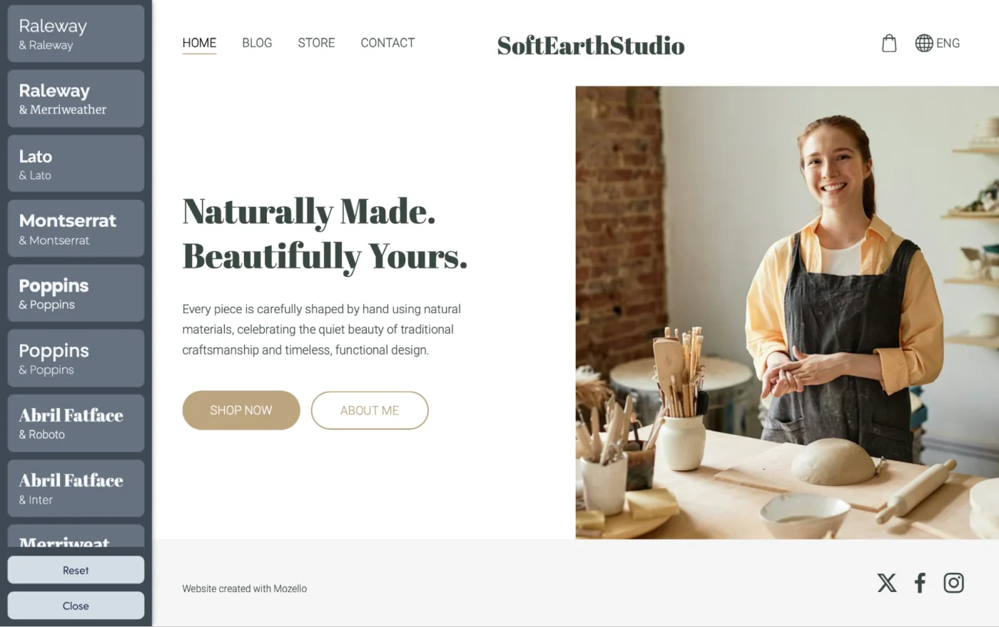
Mozello's font sets are:
- readable
- modern
- consistent
- mobile-friendly
- tested for visual harmony
This means you get professional typography without needing to be a designer.
If your business already has a brand font, you can install it
Some businesses already have a custom brand font from their designer. Mozello makes this easy too.
You can:
- upload or link your custom font using the Custom Code section
- apply it across your site
- keep your brand identity consistent
This is especially helpful for established businesses or logos created using a specific font.
Final checklist before publishing your website
Before launching your site, ask yourself:
- Is my text easy to read on both desktop and mobile?
- Do I use only 1–2 fonts?
- Are my headings noticeably larger than body text?
- Are my paragraphs spaced well?
- Does my font match my business personality?
- Are all pages using the same fonts consistently?
- Did I avoid overly decorative fonts for regular text?
If you can say "yes" to these, your typography is solid.
Conclusion: Typography is one of the easiest ways to improve your website
Good typography is not about picking the fanciest font—it's about improving communication. When you create a website using a website builder for small business like Mozello, your goal is to guide visitors, keep things readable, and make your brand feel trustworthy.
With the simple principles in this article, you'll avoid beginner mistakes and create typography that supports your message beautifully.